
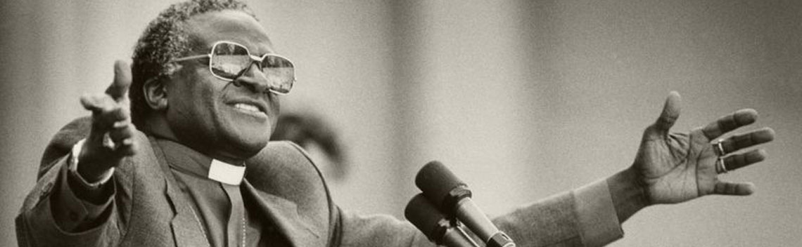
Case Study: The Arch
The Brief
Create a cohesive visual language for a four-part documentary honouring one of the world’s most respected moral leaders.
The work needed to feel reverent but not sentimental, cinematic but restrained. The graphics had to elevate the narrative without competing with it for supporting interviews, archival footage, and emotionally charged storytelling.
This was less about decoration and more about defining tone.
The Challenge


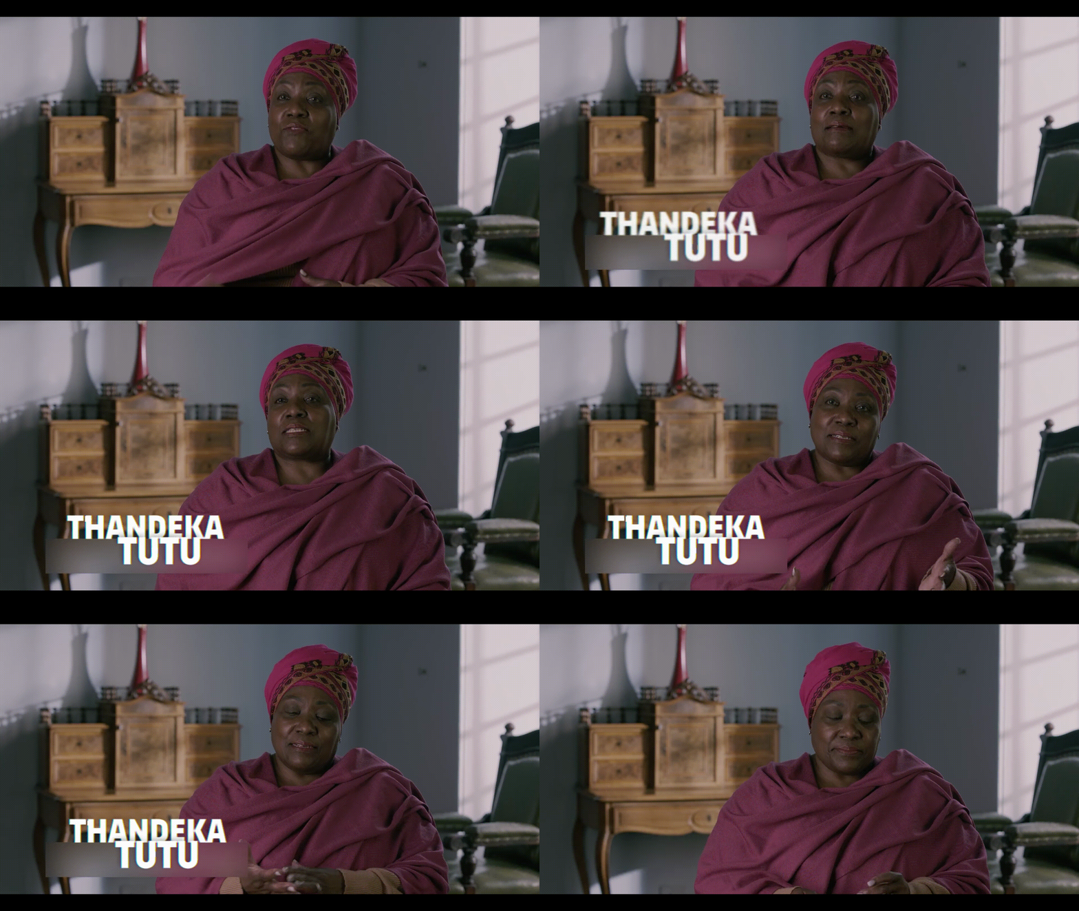
Execution
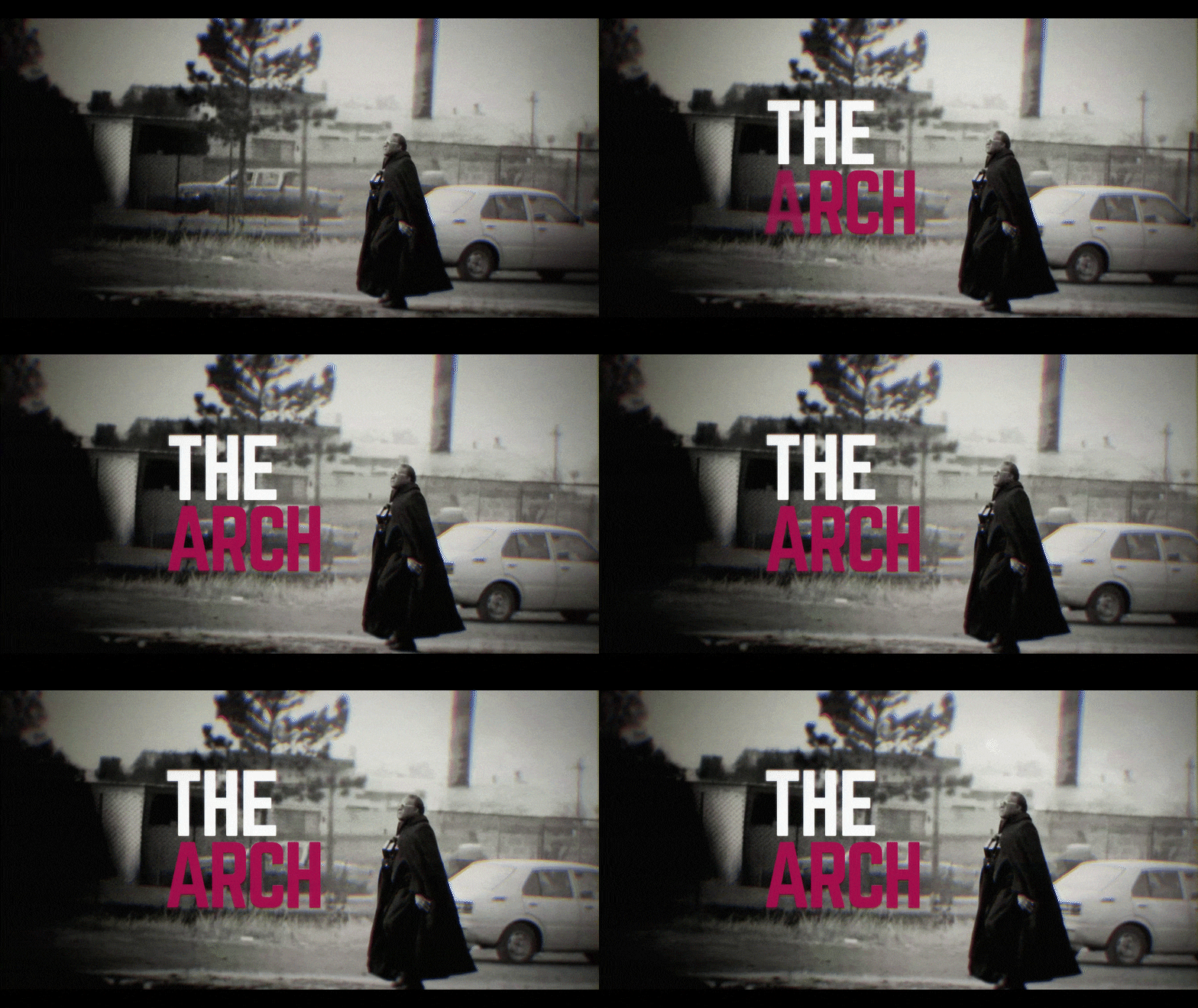
I developed the title sequence as the emotional entry point to the series — using controlled pacing, refined typography, and intentional negative space to establish tone. The motion was deliberate and measured, allowing the weight of the story to lead.
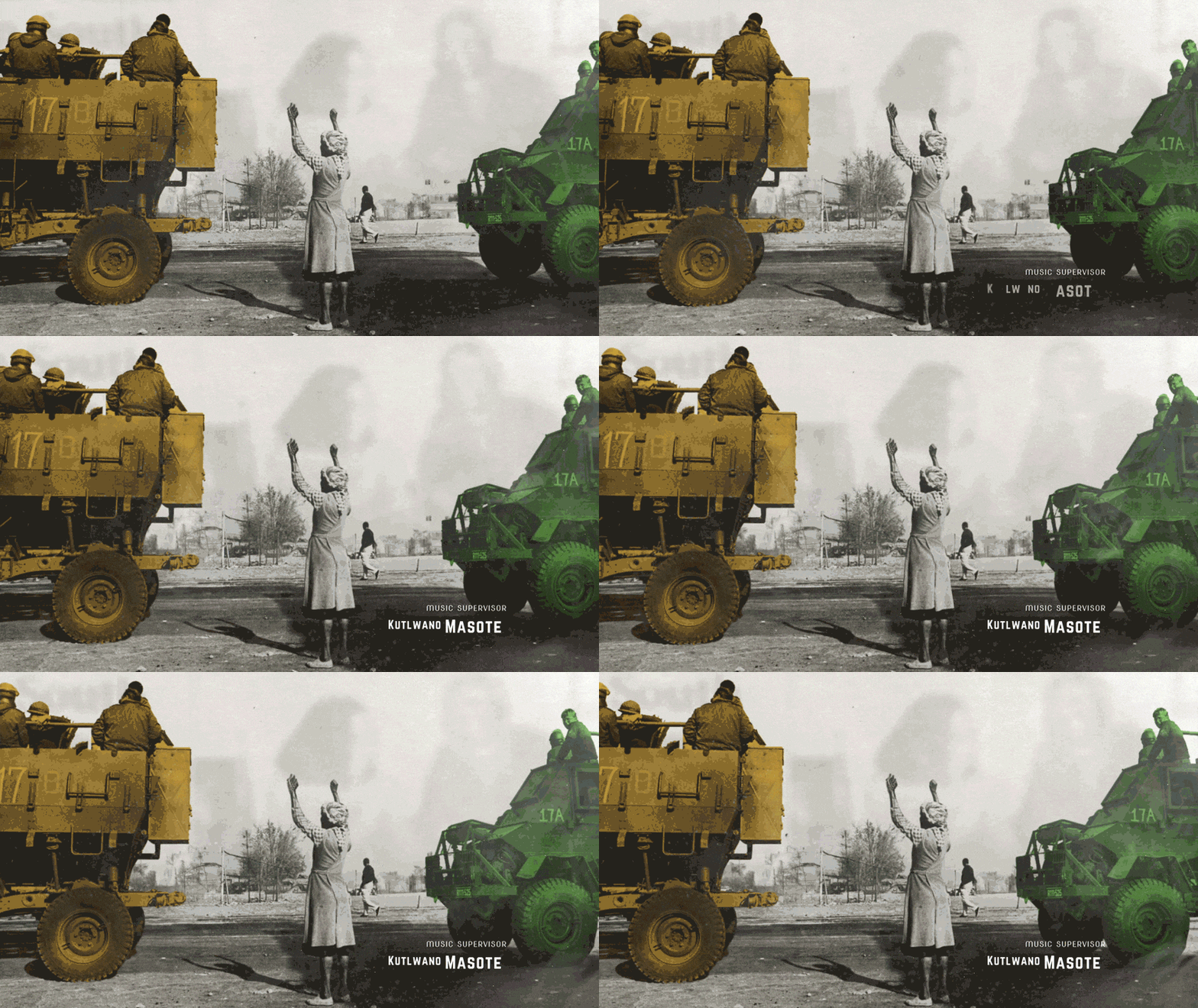
From there, I designed a lower-third system and motion framework that prioritised clarity and subtlety. Hierarchy, spacing, and animation timing were carefully calibrated to remain present but never intrusive.
Beyond individual assets, I established visual rules:
- Typographic hierarchy and scale logic
- Motion behaviour and transition pacing
- Placement systems adaptable to interview and archive formats
- Cohesive tone across all four episodes
The result was a unified design language rather than isolated graphic moments.
Impact
This project demonstrates my ability to:
- Translate abstract tone into a refined visual system
- Lead motion direction across long-form storytelling
- Design frameworks that scale beyond single deliverables
- Execute with precision and intentional restraint
It’s an example of shaping narrative through design while balancing concept, craft, and leadership within culturally significant work.